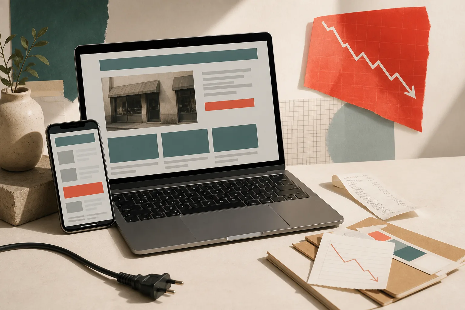
An outdated website does more than make a weak first impression. It can lower search visibility, undermine confidence, and add unnecessary obstacles between an interested visitor and a sale. The warning signs below will help you decide whether focused improvements are enough—or whether it is time for a full small business website redesign.
15 signs your website needs attention
Your site is frustrating on a phone
More customers browse on phones than many owners realize. If visitors must pinch, zoom, scroll sideways, or fight overlapping buttons, they will often leave before they learn what makes your business worth choosing. A responsive layout is now a basic requirement, not an enhancement.
Pages take too long to load
Large images, old plugins, unnecessary scripts, and inexpensive hosting can turn every click into a wait. Slow pages create doubt and make impatient visitors return to the search results. Compress media, remove unused code, and test key pages on a real mobile connection.
The text is tiny or difficult to read
Small type, low contrast, long paragraphs, and decorative fonts force people to work for information. Readable body text, generous spacing, useful headings, and strong contrast make your expertise easier to understand—and your business easier to trust.
Your contact forms are broken or unreliable
A form that fails silently can cost you leads for months. Submit every form yourself, confirm the success message, check that notifications arrive, and make sure the fields are comfortable to complete on a phone.
Your photography no longer represents the business
Blurry images, dated team photos, stock photos, or pictures of products you no longer sell create a credibility gap. Current, authentic photography helps customers recognize your people, location, workmanship, and offer.
Old services, prices, or hours are still listed
Outdated details create extra calls, awkward conversations, and disappointed visits. Your website should match what customers hear on the phone, see on social media, and find on your business listings.
Navigation makes people guess
If visitors cannot quickly find services, service areas, pricing guidance, contact details, or next steps, the menu is working against them. Use familiar labels and organize pages around customer questions—not your internal company structure.
There are no recent reviews or trust signals
People want reassurance before they contact a small business. Specific testimonials, project examples, credentials, warranties, team details, and community connections turn broad claims into believable evidence.
Calls to action are weak, vague, or missing
Every important page should make the next step clear. Replace passive phrases like ‘learn more’ with actions tied to intent: request an estimate, schedule a consultation, view the menu, check availability, or call the shop.
The browser warns that the site is not secure
An HTTP address or certificate warning can stop a customer instantly—especially before a form or purchase. Your entire site should use HTTPS, redirect old HTTP links, and keep certificates and software current.
Your branding changes from page to page
Mismatched logos, colors, fonts, button styles, and tone make a site feel patched together. Consistency signals care. A focused design system makes every page feel like part of the same trustworthy business.
The design looks frozen in another era
Trends alone are not a reason to redesign, but narrow layouts, glossy buttons, crowded sidebars, auto-playing media, and Flash-era interactions can make a capable business look inactive. Modern design should feel clear and intentional—not fashionable for its own sake.
You cannot update the site yourself
When changing a photo, service, or announcement requires a developer every time, small inaccuracies accumulate. A practical content system should let your team handle routine edits safely while protecting the overall design.
Search engines cannot understand your pages
Missing page titles, duplicated copy, weak headings, broken links, and thin service pages make it difficult for search engines—and people—to understand what you offer. A redesign is a chance to rebuild the content structure around real customer searches.
The website has not meaningfully changed in years
A site can remain technically online while becoming less accurate every season. If nobody remembers the last review, schedule one now. Check every page for current information, working links, relevant proof, and a clear business purpose.
When to redesign a website
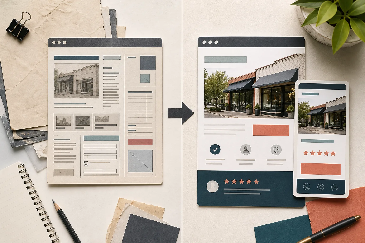
You do not need a full redesign every time a phone number changes or a photo feels stale. A focused update may be enough when the site’s structure, technology, and visual system are still sound.
A full website redesign makes more sense when several problems overlap: the platform is difficult to maintain, the mobile experience is poor, the offer has changed, the brand no longer fits, or the site cannot support your current marketing and sales process. Redesigning these pieces together is often more efficient than continuing to patch a weak foundation.
Do not redesign simply to look newer. Redesign to make the business clearer, more credible, easier to find, and easier to choose.
A practical website redesign checklist
- Confirm your current services, locations, hours, prices, and contact details.
- Identify the pages customers visit before calling, booking, or buying.
- Review the site on several phones and test every form and link.
- Measure page speed and reduce oversized media or unnecessary scripts.
- Collect current photography, reviews, credentials, and project examples.
- Simplify navigation and give each page one clear primary action.
- Plan redirects so valuable old URLs do not become dead ends.
- Set up analytics, search tools, security, backups, and an update routine.
A better website should earn its keep
The goal of a small business website redesign is not decoration. It is a clearer path from first impression to confident action. Your refreshed site should accurately represent the business, answer real questions, work smoothly on every device, and make the next step feel easy.
Let’s review the signs together.
We can help you separate quick wins from deeper structural problems and plan a website that supports the business you run now.
Request a website review ↗