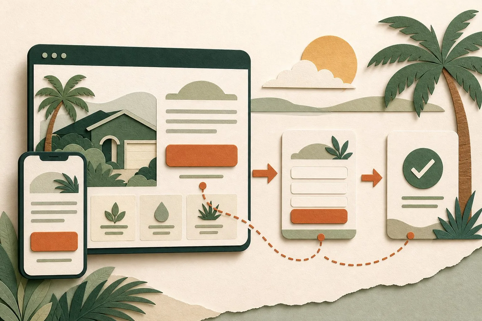
A visitor can understand your service, like your work, and still leave without contacting you. Sometimes the missing piece is small: the website never explains what to do next, or its button promises something the next screen does not deliver.
These website call to action examples help local service businesses choose the right words, destination, and follow-up. They are original copy examples, not client results or claims about a guaranteed conversion lift. Adapt them to the services, staffing, and booking process your business actually has.
Start here: use Request a quote when the price needs review, Book an appointment when someone can reserve a real time, and Call about availability when a staffed phone conversation is the next useful step. Give visitors who are still researching a quieter option such as See project examples.
Choose the action before writing the button
A call to action, or CTA, is a prompt that guides a visitor toward a next step. It might be a button, a text link, or a short section containing both. For a small business, its job is to make the next decision understandable.
Write one sentence before choosing the label: “After reading this page, the right customer should be able to ___.” Complete it with an action your business can fulfill, not a vague goal such as “engage with us.”
Then check three things:
- Readiness: Is this visitor choosing a provider, comparing options, or learning what the job involves?
- Commitment: Are they requesting information, submitting a project for review, or agreeing to an appointment or purchase?
- Capacity: Can your team deliver the promised response, appointment, download, or estimate?
A property owner comparing a major renovation may need project examples before a consultation. Someone looking for routine pool service may be ready to ask about coverage and scheduling. Neither needs a louder version of “Get started.” They need a next step that fits the decision.
12 website call to action examples and where they should lead
Treat this table as a selection tool. The destination is part of the promise. Do not copy “Book,” “Download,” or “Check” unless the next screen actually supports that action.
| Visitor's task | CTA example | Matching destination |
|---|---|---|
| Ask about a custom job | Request a quote | A short form for service, location, project details, and reply information |
| Arrange an estimate that needs staff approval | Request an estimate visit | A request form that clearly says the visit is not confirmed yet |
| Reserve a real appointment | Book an appointment | A working booking calendar with available times and confirmation |
| Ask about a time-sensitive need | Call about availability | A callable number with accurate staffed hours nearby |
| Explore a larger project | Discuss your project | A consultation or project inquiry form with clear next steps |
| Check geographic fit | Check our service area | A truthful coverage page or functioning location checker |
| Compare visible work | See project examples | Relevant, permission-cleared examples of actual work, or clearly labeled concepts |
| Understand the offer | Compare service options | A useful scope or package comparison, not a generic contact page |
| Understand price factors | See what affects your estimate | An explanation of scope, variables, exclusions, and the quoting process |
| Submit an image for preliminary review | Send project photos | A secure, tested upload form with file limits and privacy guidance |
| Obtain a planning resource | Download the planning checklist | The promised accessible file, with any email requirement disclosed first |
| Take the final step in an inquiry form | Send my request | Submission handling followed by an accurate receipt message |
“Contact us” still works as a navigation label or a general contact option. On a service page, a more specific CTA can clarify the task. “Request a quote” tells someone more than “Submit” before they have even seen the form.
Do not put all twelve options on one page. Choose the action that fits that page, then make the rest of the content support it.
Three complete CTA examples for Southwest Florida businesses
These are hypothetical scenarios, not Local Legacy Consulting client case studies. Their local context concerns service coverage, property access, and scheduling. Adding a city name to every button would not make them more useful.
A Cape Coral pool-service page
Primary CTA: Request pool service.
Supporting copy: Tell us the property ZIP code and whether you need recurring care or a one-time visit. We will review the request before confirming service.
Secondary link: Check our service area.
The form could begin with service type and ZIP code, then ask for the information needed to reply. Do not require an exact address before it is needed. If the team does not provide repairs, make that boundary visible before someone submits a repair request. For local website context, see our Cape Coral services.
A Fort Myers renovation-project page
Primary CTA: Discuss your renovation.
Supporting copy: Share the project type, general location, and stage of planning. We will explain whether an introductory conversation or site visit is the appropriate next step.
Secondary link: See project examples.
The destination should preserve that project context. A form that immediately demands finished architectural drawings may be a poor fit for an owner still assessing feasibility. A basic project description can start the conversation; detailed documents can follow when needed. Our Fort Myers page explains Local Legacy Consulting's local service focus.
A regional property-service page
Primary CTA: Request a service visit.
Supporting copy: Tell us which service you need and where the property is located. We will confirm coverage, access arrangements, and availability before booking.
Secondary link: Review available services.
For a business serving multiple parts of Southwest Florida, ask only for location details that help determine coverage or routing. Avoid a universal “Same-day service” claim unless operations can support it under clearly stated conditions. If hours or capacity change, update the CTA's supporting copy along with the scheduling system.
Make the destination and confirmation match
The button, destination, and confirmation should describe the same transaction. A quote request is not a completed sale. A preferred appointment date is not a reserved appointment.
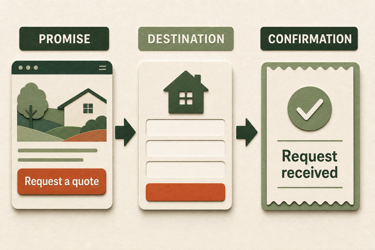
For a quote-request flow, a practical sequence is:
- Before the click: state what the visitor is requesting and any material condition, such as a paid site assessment.
- On the form: carry over the service context and ask questions that change routing, eligibility, or the first reply.
- At submission: explain the action with a label such as “Send my request.”
- After successful receipt: confirm that the request arrived, explain who responds next, and distinguish a request from a confirmed booking.
- Behind the scenes: verify delivery to the right inbox or customer system and assign a person to follow up.
One adaptable confirmation is: “Your request has been received. Our team will review the details and contact you to discuss next steps. No appointment has been booked.” Use it only when the system has actually accepted the request. Add a response window only if you can reliably meet it.
Local Legacy Consulting's lead-generation tools cover contact, quote, and consultation flows. A form interface still needs a working submission destination and an owner for follow-up; installing a widget alone does not complete that process.
Place the CTA where a decision becomes possible
Start with one visually dominant action for each page's main job. On a long service page, repeat that same action after information that resolves a meaningful question, such as scope, project examples, or the process. Repetition can help readers reach the action without returning to the top; a different offer in every section can make the page harder to understand.
A quieter secondary link can help visitors who are not ready to inquire. For example, “Discuss your project” and “See project examples” serve different levels of readiness. They do not need equal visual weight.
Put relevant evidence near the decision without filling the area with unrelated badges. For choosing that evidence, use our guide to website trust signals. If several parts of the site prevent visitors from progressing, the website redesign warning signs can help distinguish a focused CTA repair from a larger problem.
Check the controls, not just the words
- Use descriptive link text. W3C's link-purpose guidance explains why a link's purpose should be understandable from its text or associated context.
- Keep a visible keyboard focus indicator and test the path without a mouse. Use a real link for navigation and a real button for an in-page action or submission.
- Give form fields clear labels. Placeholder text is not a dependable replacement for a visible label; see W3C's form-label tutorial.
- Make targets comfortable to tap and keep neighboring controls apart. WCAG 2.2's minimum target-size criterion uses 24 by 24 CSS pixels with defined exceptions, including spacing. That is a minimum criterion, not a reason to make the primary button tiny.
- Check that a sticky contact bar does not cover form fields, error messages, consent controls, or the confirmation. Test with the phone keyboard open.
- Use adequate text and control contrast, including focus and error states. Color should not be the only way a visitor can tell what happened.
These are practical checks, not a complete accessibility audit or a certification.
Measure completed inquiries, not just button clicks
CTA click-through can reveal interest, but it does not tell you whether the form worked or the inquiry fit your business. Keep a small measurement chain:
| Stage | What to record | What it can help diagnose |
|---|---|---|
| Service-page visit | Relevant page visits and traffic source | Whether the right audience reaches the offer |
| CTA interaction | Clicks or form starts | Whether visitors find and choose the next step |
| Successful inquiry | Accepted form submissions or confirmed bookings | Whether the destination works |
| Qualified inquiry | Requests your team can actually serve | Whether the offer attracts useful demand |
| Customer outcome | Appointments attended or work agreed | Whether the full process supports the business |
Google Analytics documents measuring a specific lead form as a key event, and its recommended events include generate_lead. Have the implementation checked against successful receipt, including failed-validation and duplicate-submission cases. Do not count the same inquiry twice through two event setups. A telephone-link click indicates intent to call, not proof that a call connected.
Keep names, emails, phone numbers, and free-text customer requests out of Analytics events and page URLs. Google's guidance on avoiding personally identifiable information explains this boundary. Use your authorized customer system for personal inquiry details.
For a low-traffic business, start with task testing: ask a few people to find a service and explain what they expect the CTA to do. Then fix broken delivery, unclear promises, and unnecessary questions before testing cosmetic variations. If you compare results before and after a change, record changes in traffic sources, promotions, season, and staffing. A handful of inquiries is not proof that a button caused an improvement.
A practical CTA review you can do today
Pick one important service page and complete this worksheet:
- Page and visitor need: What decision brought someone here?
- Primary action: What should the right visitor do next?
- Exact label: Does it name that action clearly?
- Destination: Does the next screen deliver what the label promised?
- Commitment: Is it clear whether this is a request, booking, or purchase?
- Required information: Does each field help the next real step?
- Receipt and routing: Does a test inquiry arrive, and who owns the reply?
- Mobile and keyboard check: Can someone complete the task and recover from an error?
- Measurement: Can you separate interaction, receipt, and qualification?
Use a clearly marked test inquiry, confirm its delivery with the team, and exclude it from performance reporting. Save the old wording, the change date, and what you expect to improve. That gives the next review a useful starting point.
Frequently asked questions
What is a good call to action for a service business?
One that accurately describes the visitor's next step. “Request a quote,” “Discuss your project,” and “Book an appointment” can all work when the destination and business process match. There is no universally best phrase or guaranteed lift.
How many calls to action should a page have?
Begin with one primary action for the page's main task. You can repeat it on a long page and add a secondary research option. A multi-service homepage may need several service paths; it does not need every offer competing as a primary button.
Should my button say “Get a quote” or “Request a quote”?
“Request a quote” is clearer when a person must review the project before pricing it. “Get an instant estimate” should lead to an immediate estimate and explain its assumptions and limits. Do not suggest an immediate price if the visitor only receives a callback request.
What color should a CTA button be?
Choose a color that fits the design, contrasts appropriately with its surroundings, and leaves the text readable. Maintain a clear visual hierarchy and visible focus state. A color's performance depends on the page; there is no universal winning color.
Should I require a phone number on every lead form?
Only when a phone conversation is necessary for the next step. If an email reply can handle the request, consider making the phone field optional. Explain why required details are needed and avoid collecting information just because the form supports it.
Make one next step easier to complete
Useful website conversion optimization starts with a promise the business can keep. Choose an action, connect it to a relevant destination, confirm receipt honestly, and make sure the team can respond. That is a manageable improvement even before a broader redesign.
Local Legacy Consulting's Legacy Refresh can help align the page, inquiry flow, and customer expectations. If that is the problem on your site, request a website review and tell us which page or inquiry step needs attention.